Saturday, 31 October 2020

Nature Inspired Resort In Bali


Text description provided by the architects. Located inland in Bali, this wellness retreat has been integrated into a forest that borders luscious rice fields on one side and a dramatic river on the other. The river converges water from the whole area creating a junction of small waterfalls that produces enough flow to power a hydro electric generator that can sustain the power of the buildings within the complex. Merging with nature has been at the forefront in the approach to the design, not just by its operation but by using materials found directly on the site and the immediate locality, therefore enabling the resort to become fully carbon zero.


The first instigation of this can be seen in the dramatic use of rammed earth for all ground level walls. Being located on a hill required significant ground works, therefore with much excess soil, creating these significant mass of curved walls was easily justified. Along with being able to connect the occupant to the beauty of rammed earth with its physicality and layered coloring, it also maintains superior insulation and structural properties. Being very intensive to build we were able to recruit the nearby village to work on what has become the most substantial rammed earth project in Indonesia.


The rest of the structure has been made with bamboo, much of which was harvested from the site. Not only is this fast growing material incredibly sustainable, its flexibility means were able to create spaces that echo the abundance of life in the tropics. Built objects have been created which seek to biologically morph from the surrounding elements, in effect growing from the ground and sprouting among the rich vegetation.


One such building is the yoga studio which literally floats from the cliff’s edge with a cantilevered structure supporting a parabolic bamboo pavilion. The rooms themselves provide the eco luxury that is required for this up market project, with a feeling that is nurturing and in some feature bedrooms, almost cocoon like.


The guest villas too look towards a unique design, yet with the common denominator of bamboo architecture and the warming tones of rammed earth that make up the resort. The curvilinear formations of the roofs can be admired from different heights and angles while the reflections from the meandering pool below add to the effect.

Source: ArchDaily

Friday, 30 October 2020

Instreet Beijing


Text description provided by the architects. Building on a solid reputation for urban regeneration and renewal, Kokaistudios recently breathed new life into an overlooked and underused Beijing street. Drawing on design interventions including a network of canopies and increased seating, the project overhauls a neglected district to set a new benchmark for China’s public spaces.

Kokaistudios was recently commissioned by property developer CR Land to redesign Galleria-Instreet (Hereinafter referred to as “Instreet”) in central Beijing. Calling for interventions both large and small, the extensive urban renewal project has transformed what was previously an underused, sparse space by injecting all-important human scale to invite public participation. The result is a clear flow to this formerly disjointed thoroughfare, as well as community-focused lifestyle elements to cater to both residents and visitors.

Located in Chaoyang District in the northeast of Beijing, Instreet is now representative of a hybridized public space prototype that is becoming increasingly popular in Chinese cities. Comprising commercial functions as well as residential, and typically pedestrian, they feature lifestyle elements aimed squarely at communities. In the case of Instreet, these include children’s play areas, a network of canopies to provide welcome shade, plentiful public seating, and flexible spaces for markets, concerts, and outdoor events of all kinds.


Despite several core landmarks - namely, a main entrance to both Phoenix Mall plus Sanyuanqiao subway station, as well as a long-redundant concrete bridge - the street lacked visual unity, its various elements disparate and unconnected. An absence of public seating contributed to not only the street’s empty feel, but also its non-human scale.


Kokaistudios’ first action was to demolish the concrete bridge that once connected the two ends of Instreet. An unnecessary feature along an already pedestrianized route, and disliked by locals, it was largely unused. Furthermore, it brought the negative effect of obstructing the line of sight from one end of the street to the other. Its razing opened up the space significantly, further highlighting the street’s distinct lack of character. At the same time, the bridge’s demolition presented multiple opportunities for design interventions.

A total re-landscaping of the area saw the introduction of instruments aimed at encouraging public interaction and use. In particular, a network of canopies running the length of the street visually interrupt the otherwise empty space. Not only does the string of shelters provide welcome shade, come nightfall they light up in a way that is not only atmospheric, but also brings safety and security. Resembling an archipelago, they are designed as oases of various activities. These include a children’s play area; clusters of green planters; as well as plentiful benches. At the centre is a versatile open-air platform for events of all kinds, further opening Instreet for future actions and possibilities.


Smaller interventions also play a part in Instreet’s redesign. For example, an intricate rain collection system and custom-made elements such as steel tree root guard meshes are representative of the project’s close attention to detail, and elevation in quality on what was previously in place.


Frontages of existing commercial tenants, as well as future ones, have also been given an overhaul. That includes a new louvered facade to a multipurpose facility comprising a gym, restaurant, and private club for residents. Now more visually and thematically linked, a mainstay of F&B outlets feature extended terraces, surrounded by planters. The smart wooden decks, combined with rough stone elements, as well as additional trees all make for a pocket of nature in the heart of Beijing. The overall effect is welcoming, comfortable and in keeping with Instreet’s refined lifestyle focus.

Completed in 2020, Instreet’s shift from underused, disjointed and bare, to a space that invites interaction through attractive, useful, and flexible facilities has been transformative both for residents, as well as the area’s economy. Now attracting higher-end businesses, as well as community initiatives by way of its multipurpose, open-air events platforms, the urban renewal project sets a benchmark for public space design in China.

Source: ArchDaily

Saturday, 17 October 2020

Factory In The Forest


Text description provided by the architects. 
Architectural competition winning entry for an electronics manufacturing plant. This site is conceived as a forest that penetrates, surrounds & steps over the building creating maximum contact with nature – green, breeze, scent, sound, touch. A canopy supported by a ‘forest’ of columns creates unity to office & courtyard while giving protection from the tropical sun. Office levels give access to roof gardens and staff are encouraged out for breaks, meetings or just contemplation.


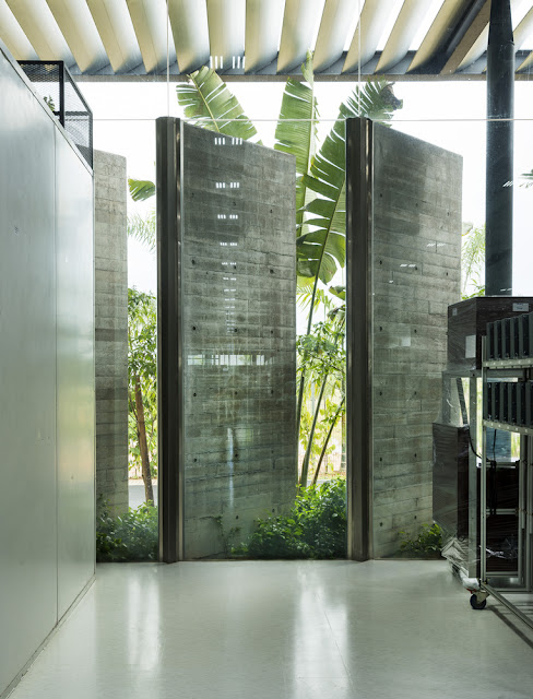
A green courtyard separates the office & factory with views and access from both. A bridge over the courtyard links the office & production & this circulation route becomes a space for meetings, breaks & lectures. The factory has views to landscape & the sky condition through full height & clerestory glazing with glazing protected from the sun by free-standing off-form concrete fins and roof louvers. Rainwater cascades from roof spouts - heightening awareness to tropical storms, to storage tanks for landscape irrigation.


The plant receives natural diffused light across the entire factory floor reducing dependency on artificial lighting that, combined with chilled water floor slab cooling & cutting-edge air-conditioning technology reduces energy consumption to half that of a conventional plant of similar size.


Structure & materials are expressed; off-form reinforced concrete and steel structure, glazing and landscape. With this small palette of materials, the building explains to us what it is, what it is made of & how it is put together. The approach was to create a stimulating & meaningful working environment for all employees – the forest to be the face of the building & company. Forests, critical for both macro & micro-climates are also vital for our psychological well-being.

Sustainability - From project onset, the client wanted an energy efficient and climatically responsive building. The cardinal sustainable design principles were energy efficiency, water efficiency, daylighting and biophilia – the fundamental human need for connection to Nature.

The building is designed to shield against the hot & glaring tropical sun, while allowing diffused natural daylight to filter into the building. The office & courtyard are shaded by a louver canopy designed to provide effective solar protection during the hottest part of the day.

The factory skylight design was optimized to achieve an evenly day-lit work environment. The simulations and daylight measurements in operation show that the factory floor achieves an evenly day-lit work environment without glare throughout the year. Dimmable daylight responsive LED lighting and individual task lighting ensures that the required light levels are always obtained.

An innovative radiant floor cooling system works with embedded PEX pipes in the concrete slabs throughout the factory & office. By cooling down the slabs to about 21°C, this structural element of the building doubles up as part of the cooling system. The higher chilled water temperature and the water-borne cooling transport makes the radiant floor slab cooling twice as energy efficient as conventional air-conditioning.

Source: Archdaily